Mobility · Mobile UX
Public Shuttle
Making the next shuttle clear at a glance
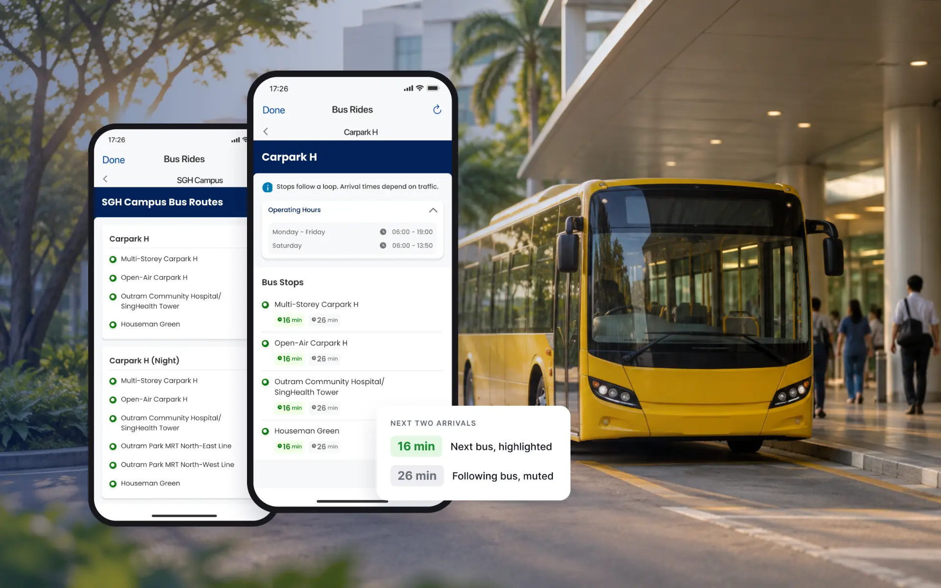
A redesign of the shuttle schedule feature for ComfortDelGro Zig, helping commuters find their shuttle service, choose a route and see when the next two buses will arrive.
- Company
- ComfortDelGro Zig
- Role
- Experience Designer
- Year
- 2024
- Duration
- 2 months, full-time
- Tools
- Figma, Miro
01 · Context
A working feature with a confusing structure
Public Shuttle lets commuters check routes and live arrival times for shuttle services run by operators such as SingHealth, KTPH, Sentosa Development Corporation and JTC.
In the original ComfortConnect app the feature worked, but its structure made it harder to use than it needed to be. I redesigned the full flow, from the entry point to the arrival screen, using the current app's design system.
What the original flow got wrong
01
Mislabelled hierarchy
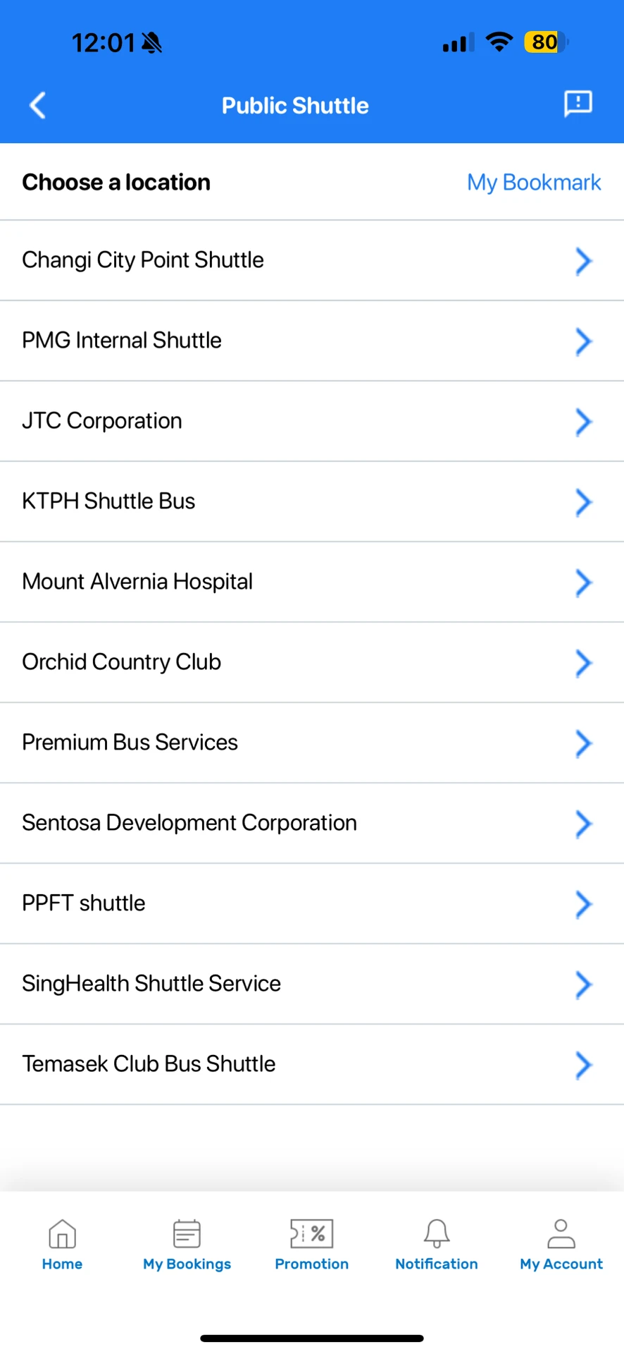
A screen titled 'Choose a location' actually listed shuttle operators. Real locations only appeared one level deeper.
02
Hidden arrival times
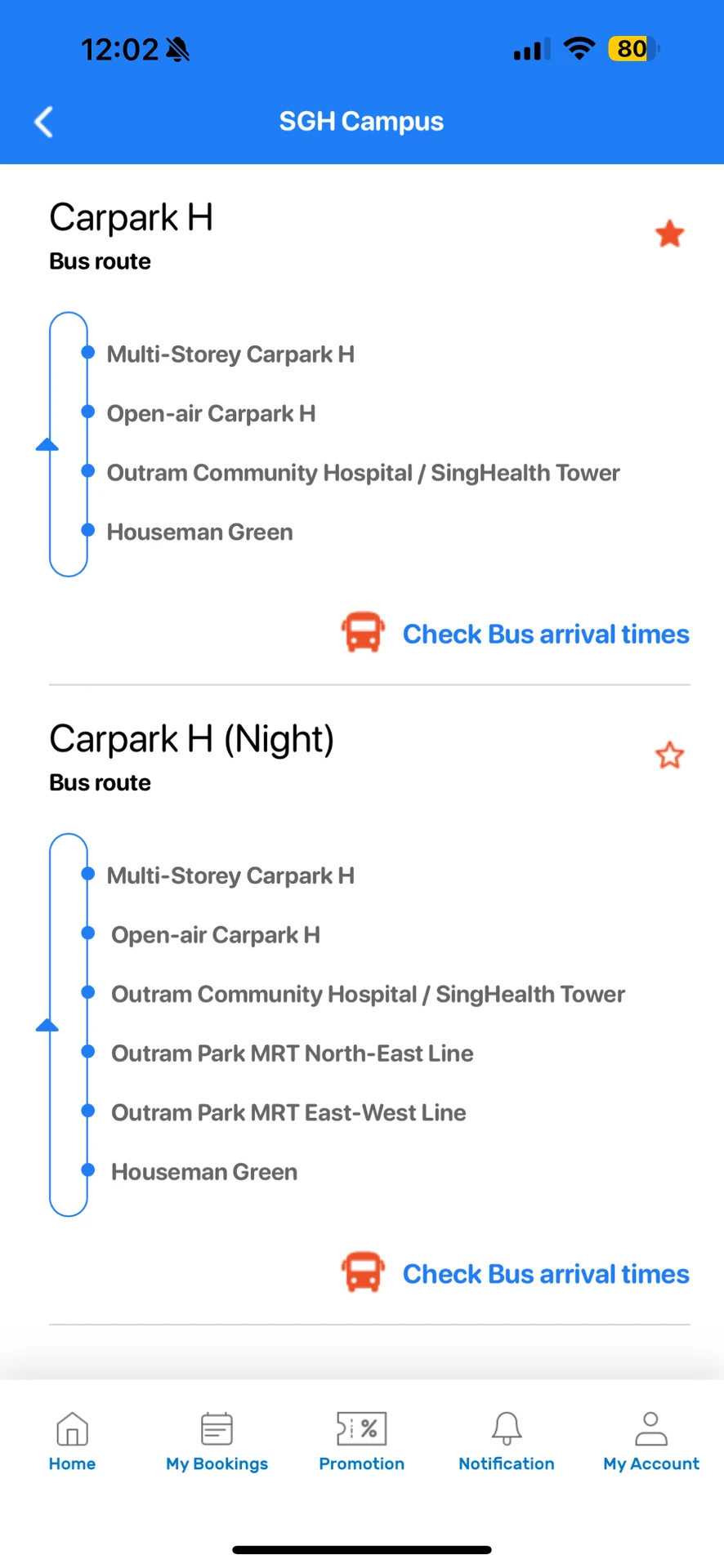
Arrival times sat behind a small 'Check Bus arrival times' text link under each route.
03
Equal-weight timings
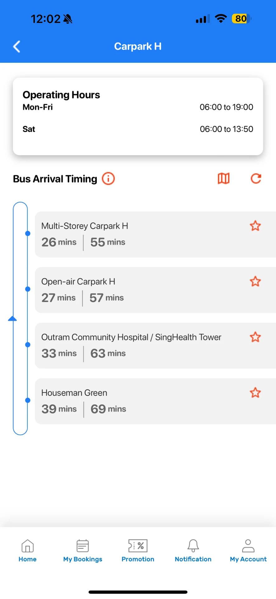
The next bus and the following bus were shown in the same grey style, so the time that matters most did not stand out.
Swipe →
02 · Structure
One question per screen: service, location, route
I separated operators from locations so each screen answers a single question, and turned each route into a card that leads straight to its timings. The pins below show where each change appears.
Titled 'Choose a location', but listed operators
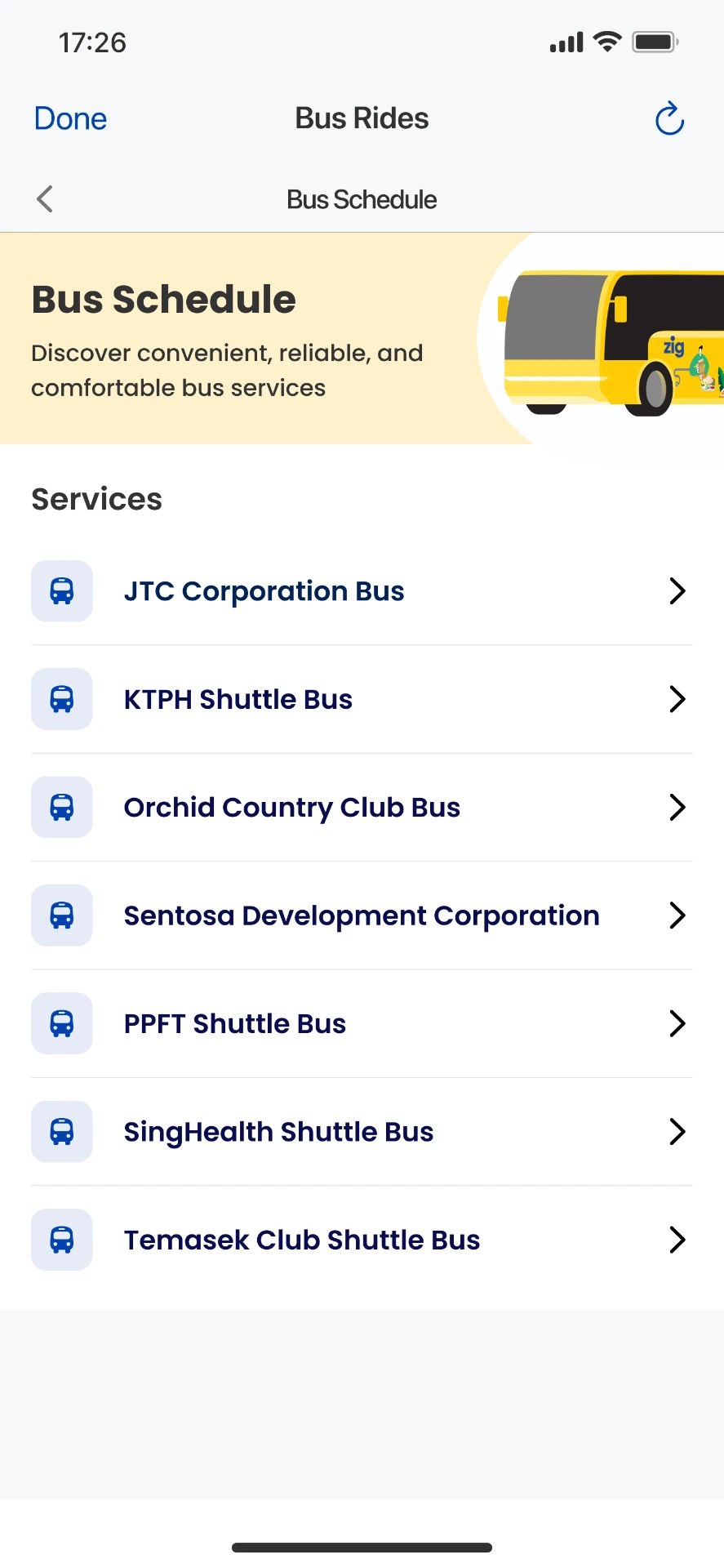
A Correctly titled 'Services', with a bus icon per operator
Numbered pins mark what to look at
Step 1 · More services
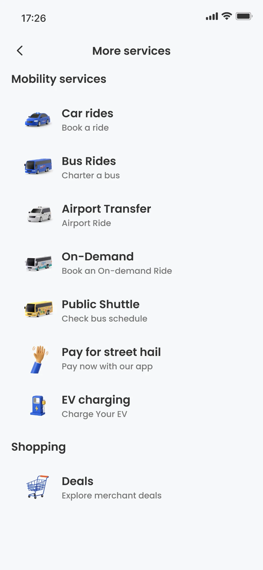
1 Public Shuttle sits alongside the other mobility services, labelled 'Check bus schedule'.
Step 2 · Services
2 Operators get a clear 'Services' heading and a bus icon each.
Step 3 · Locations
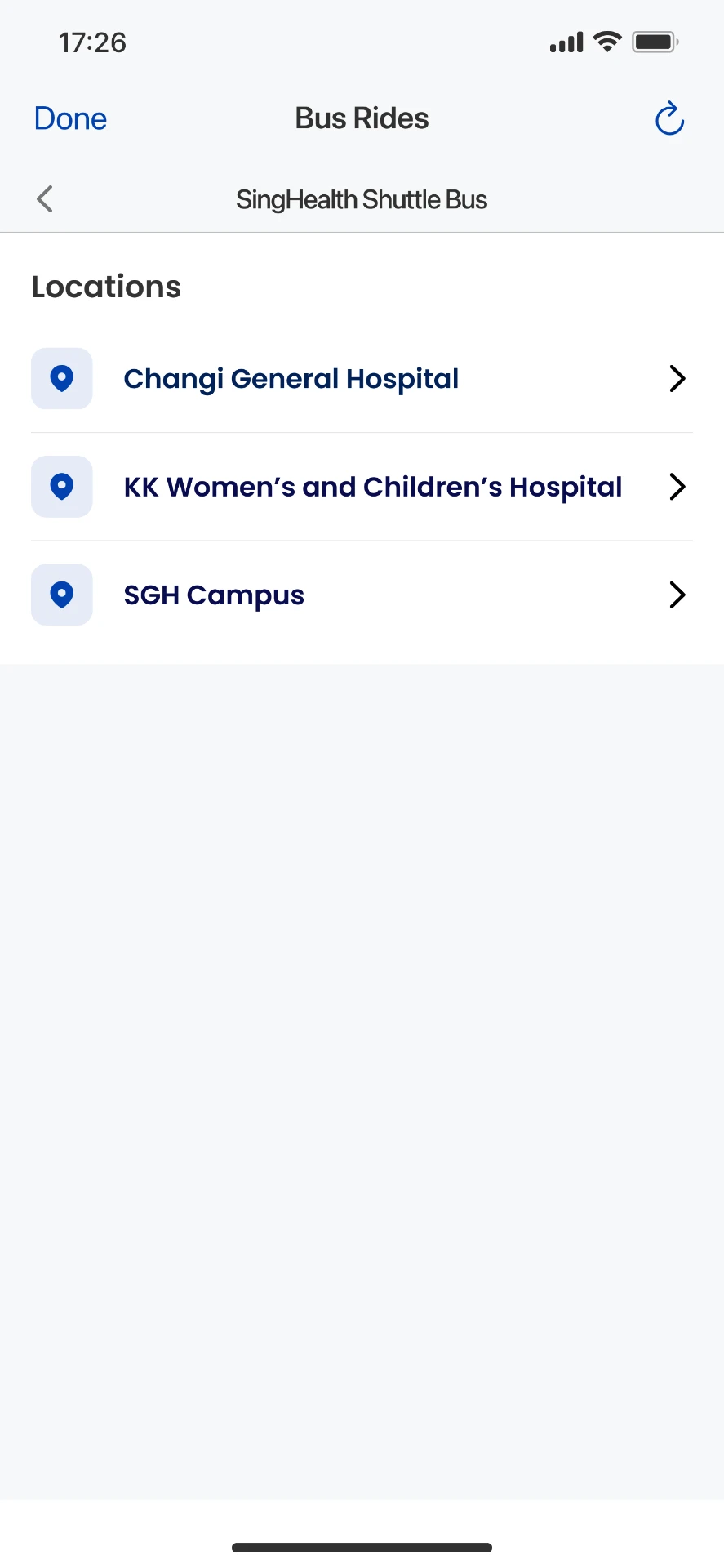
3 Locations are their own step, with pin icons. The sub-header shows which operator you chose.
Step 4 · Routes
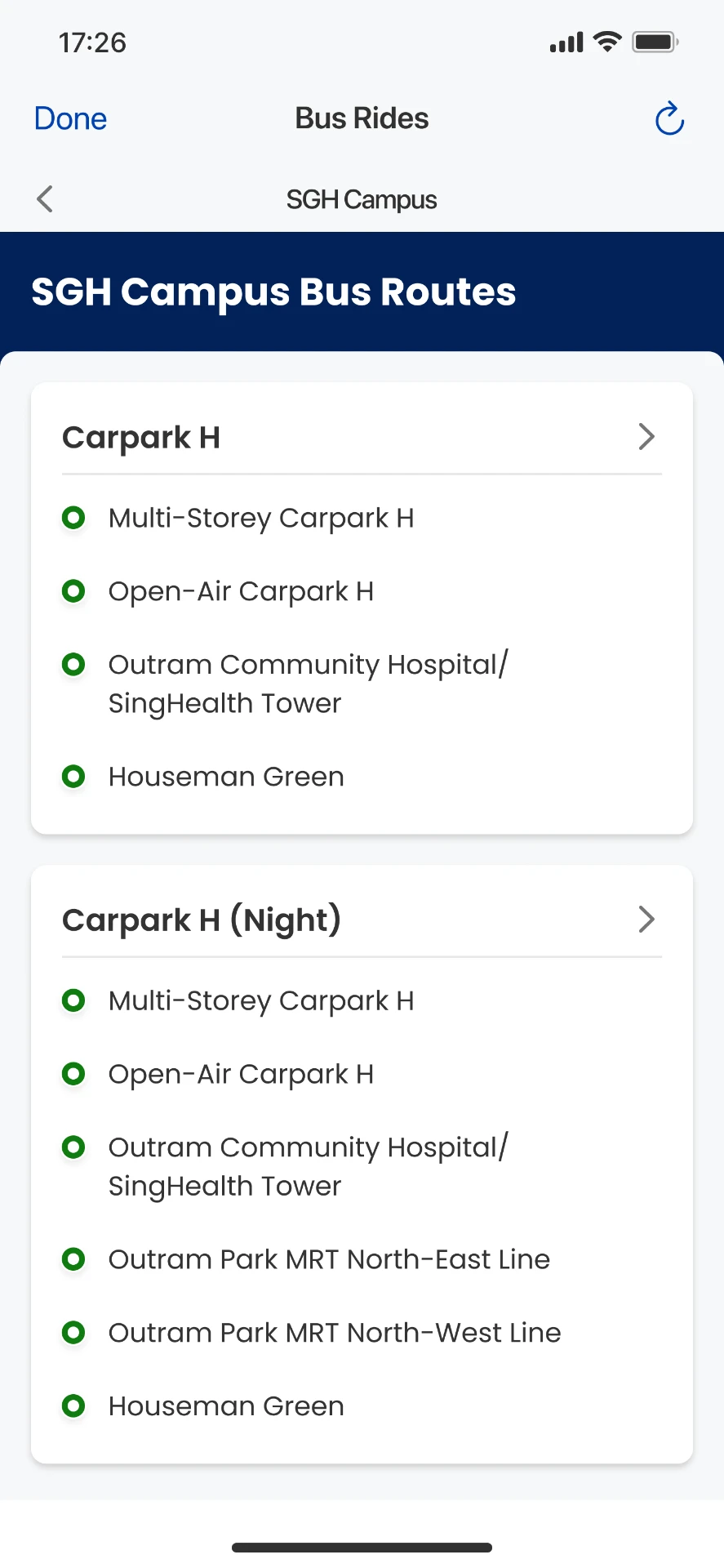
4 Each route is one tappable card that shows every stop up front, replacing the small 'Check Bus arrival times' link.
All screens designed by me in Figma, within the Zig app design system.
03 · Arrival times
The next bus comes first
Three decisions shape this screen:
Next bus first. Green chip for the upcoming bus, grey for the one after.
Hours on demand. Collapsed by default, so arrivals stay near the top.
Context in one line. Stops loop, times depend on traffic.
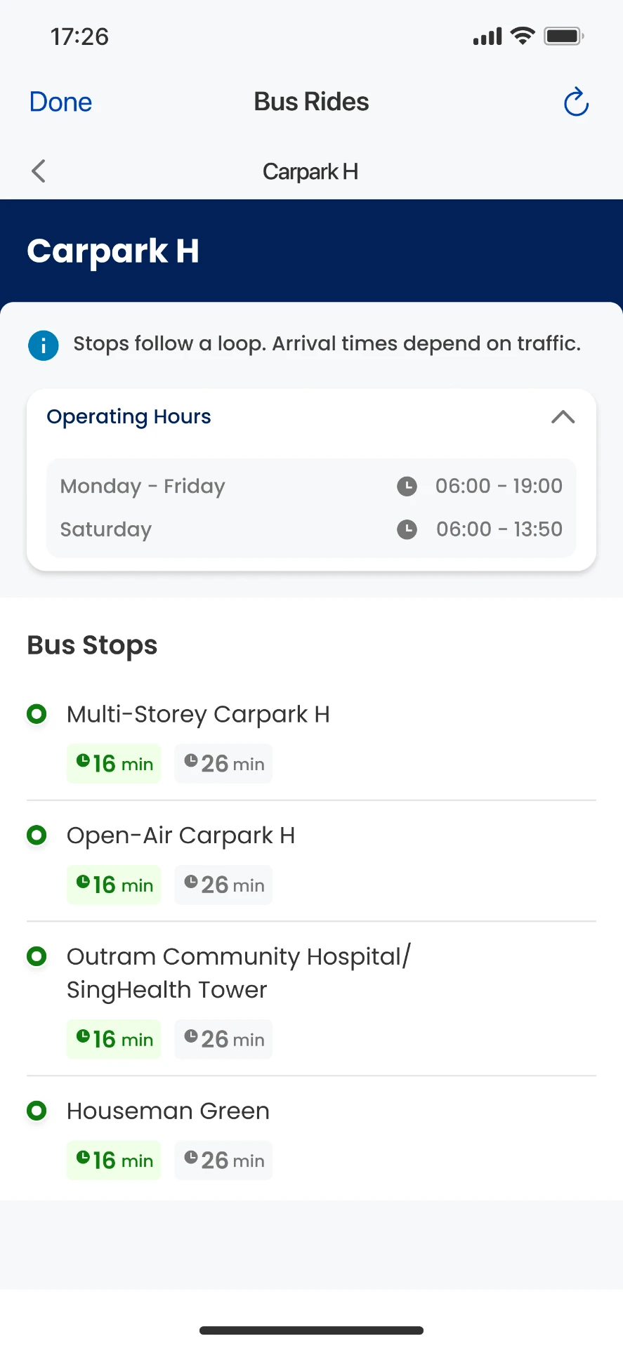
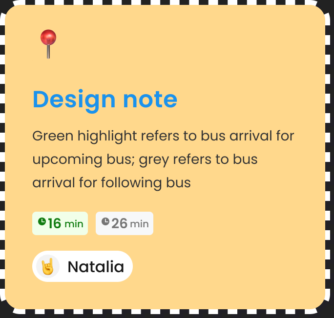
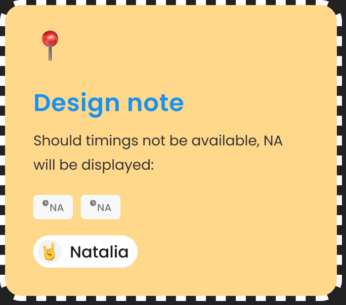
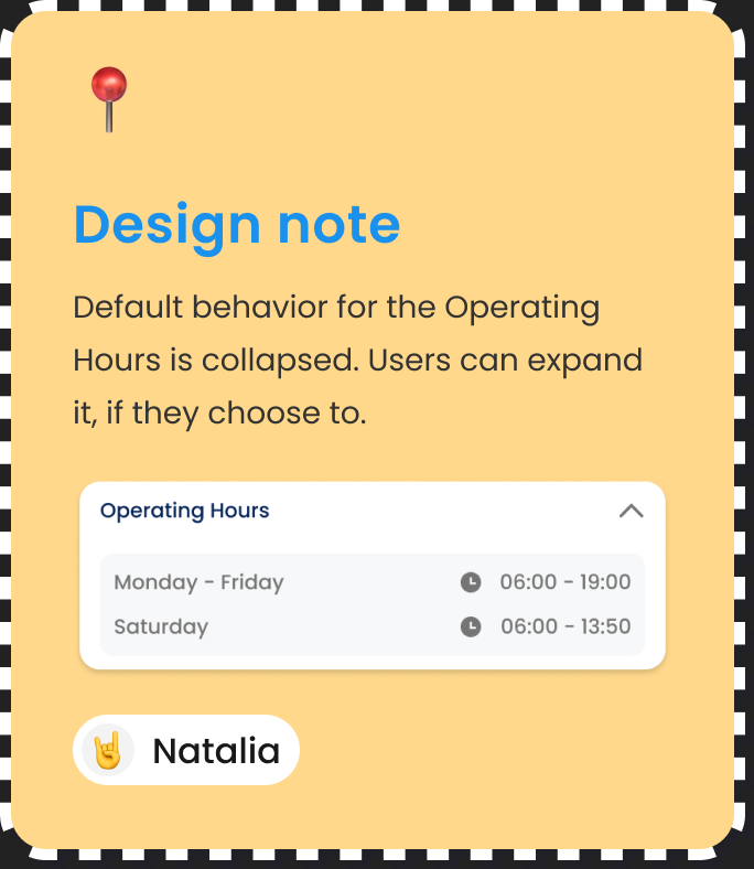
My design notes from the Figma file, left for developers.
04 · Edge cases
Designing for when things change
Shuttle schedules change by time of day, and live data isn't always available. The same layout handles both.
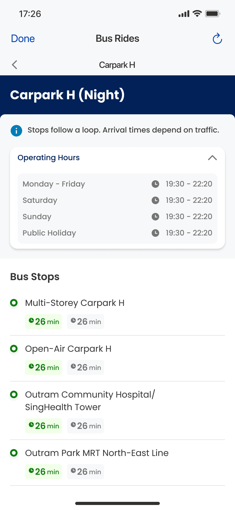
Night routes
Different stops and separate hours for weekdays, weekends and public holidays, in the same card layout.
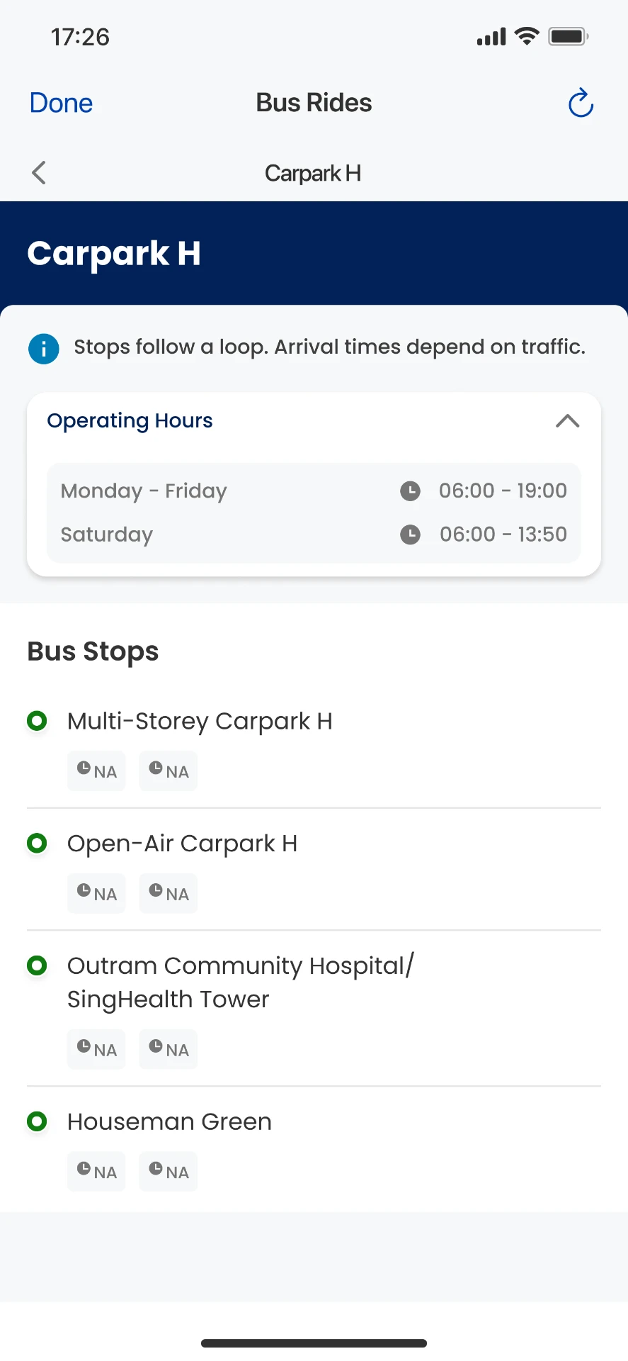
No live data
Both chips show 'NA' instead of leaving an empty gap.
05 · Reflection
Clarity over speed
The redesign kept roughly the same number of steps as before. The improvement was in hierarchy: clearer labels at each level, a direct path from route to timings, and arrival times that put the next bus first. This project taught me how much a renamed heading or a single colour decision can change how easily people read time-sensitive information.
2026 retrospective
What I would explore today
01
Stronger next-bus cue
Add a 'Next' label so the priority does not rely on colour alone.
02
Plain-language states
Replace 'NA' with 'No live data' so the meaning is clear to everyone.
03
Data freshness
Show when arrival times were last updated.
04
Nearest stop
Highlight the stop closest to the commuter's location.
These are retrospective ideas, not original project deliverables.