Case study
On-Demand Bus
Redesigning corporate bus booking for the CDG Zig ecosystem
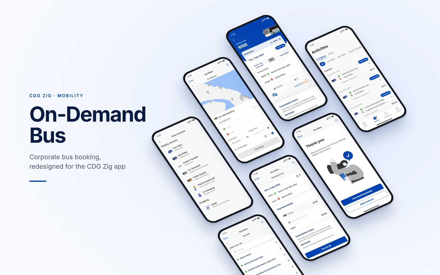
Adapting an existing corporate transportation booking experience into a more cohesive mobile interface, with a focus on booking clarity, familiar interaction patterns, and consistency within the CDG Zig ecosystem.
- Role
- UX Designer
- Duration
- 2 months
- Platform
- Mobile App
- Collaboration
- Product Manager & Developer
01 · Context & challenge
Integrating corporate transportation into CDG Zig
ComfortConnect let corporate employees book on-demand transport. This project brought its booking experience into the CDG Zig app.
- Starting point
- A standalone app with an outdated interface and booking flow.
- Goal
- Integrate the existing booking functionality into the CDG Zig mobile ecosystem.
- Constraints
- Keep established capabilities, follow CDG Zig's design system and meet corporate transport requirements.
Fragmented product experience
The original booking functionality existed outside the CDG Zig ecosystem, requiring adaptation to an established application architecture and design language.
Design consideration
Establish visual and interaction consistency within CDG Zig.
Complex booking interactions
The existing experience combined dense location lists, map-based selection, calendar overlays, and multiple booking controls.
Design consideration
Make booking inputs, navigation, and key decisions easier to understand.
Clear feedback at key moments
The original experience gave limited feedback at important points in the booking, such as when no vehicle was available.
Design consideration
Make outcomes clear at key moments — promo codes, payment, confirmation and cancellation.
02 · Reviewing the original experience
Identifying opportunities for clearer booking interactions
I reviewed the existing ComfortConnect booking flows and studied the available personas to understand the commuting experience and its constraints. I also examined comparable transportation applications to understand established booking patterns.
Activities
- Existing booking workflow evaluation
- Review of personas and commuter pain points
- Competitor interface analysis
A retrospective review of the original ComfortConnect screens highlights several usability concerns related to information hierarchy, interaction complexity, and system feedback.
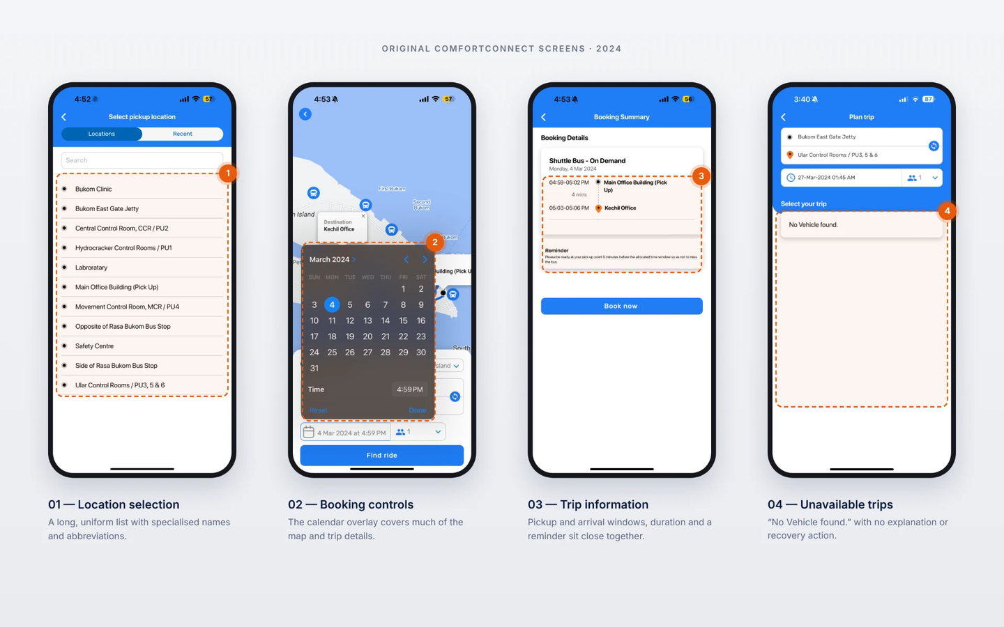
Original ComfortConnect experience
Location selection
Pickup and destination locations were displayed as long, largely uniform lists, including specialized location names and abbreviations.
Telling pickup points apart relied mainly on recognising their names, with little additional context.
Explore clearer location identification, selection states, and information hierarchy.
Booking controls
The map-based interface combined multiple location markers, route information, booking fields, and overlay controls. Calendar and passenger selectors occupied substantial screen space.
Overlapping controls and dense information could increase the effort required to understand and complete booking selections.
Evaluate how to organize inputs and establish clearer focus during each booking step.
Trip information
Booking summaries displayed multiple pickup and arrival time windows, route information, and reminders.
Users might need additional clarity to distinguish estimated pickup windows, travel duration, and destination arrival times.
Explore clearer presentation and prioritization of time-sensitive booking information.
Unavailable trips
The original interface displayed the message "No Vehicle found." without a visible explanation or recovery action.
The screen offered no route to another departure time, route or next step.
Explore actionable empty states and clearer recovery guidance.
03 · Design approach
Balancing booking usability with an established design system
Rather than designing a new transport service, I worked with existing booking functionality and brought it into CDG Zig's Bus Rides experience, using Zig's navigation, components and visual language.
Design priorities
- 1.Clarity: Present booking information and choices in an understandable way.
- 2.Consistency: Follow established CDG Zig interface patterns.
- 3.Continuity: Retain essential corporate booking functionality.
- 4.Interaction design: Communicate booking steps and interface behavior through prototypes.
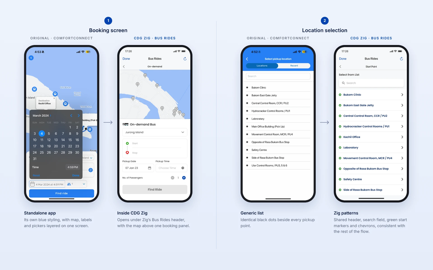
Adapting the experience into CDG Zig
04 · Planning a journey
Supporting trip selection within an established booking experience
The booking interface brings together journey inputs such as pickup location, destination, travel date, and passenger count.
Design decisions
- Kept the map as context, with all trip inputs grouped in one booking panel below it: service area, start and stop, date, time and passengers.
- Made start and stop points selectable from searchable lists, colour-coded green for start and red for stop to match the route on the map and in the summary.
- Moved date and time selection into focused pop-ups with clear Confirm and Cancel actions, and noted that times follow the pickup point's time zone.
- Replaced the passenger dropdown with a simple − / + stepper.
- Kept “Find Ride” inactive until the required trip details are filled in.
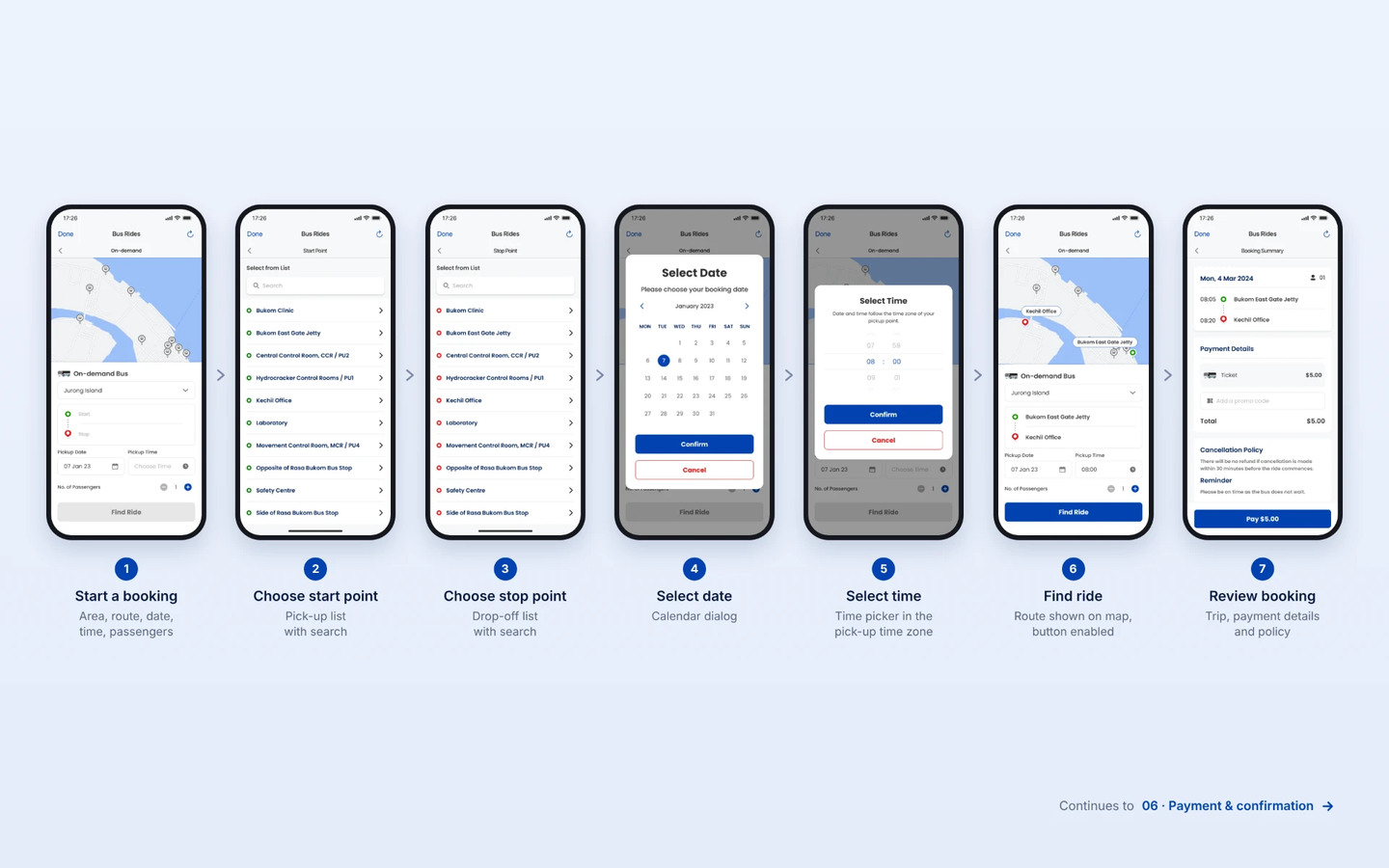
Redesigned CDG Zig interface
05 · Reviewing booking details
Presenting essential trip information before payment
The booking summary brings together the trip details, fare and booking conditions before the final payment action, so users can check what they are confirming in one place.
Design decisions
- Grouped the date, passenger count, times and stops into a single trip card.
- Showed the ticket price, promo code field and total before payment.
- Placed the cancellation policy and reminder on the summary, so conditions are visible before confirming.
- Labelled the final button with the amount to be paid, e.g. “Pay $5.00”.
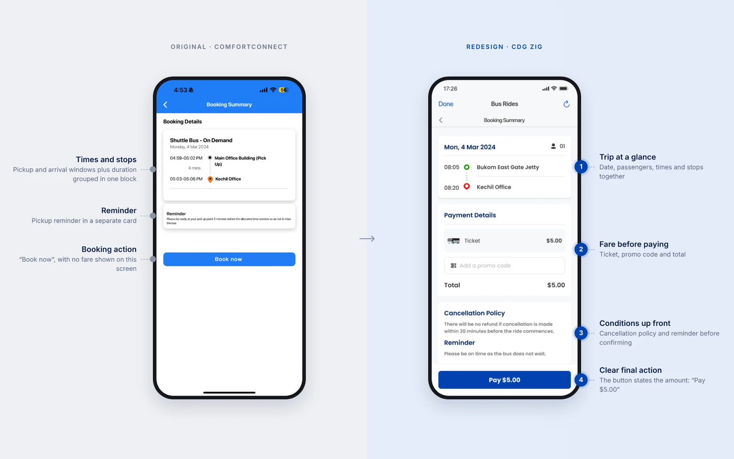
Redesigned CDG Zig interface
06 · Payment & confirmation
Completing the booking with clear payment feedback
The payment step brings together promo code validation, payment method selection and a booking confirmation, so the transaction is clear before and after the user pays.
Design decisions
- Gave inline feedback on promo codes: an error when a code isn’t applicable, and a discount line with an updated total when it is.
- Updated the payment button to reflect the new total after a promo is applied.
- Listed saved cards with expiry dates, with the option to add a new payment method and a short note explaining the card authorisation hold.
- Ended with a confirmation that tells users where to find their booking, with “View Booking Details” as the main action and “Back to Home” as secondary.
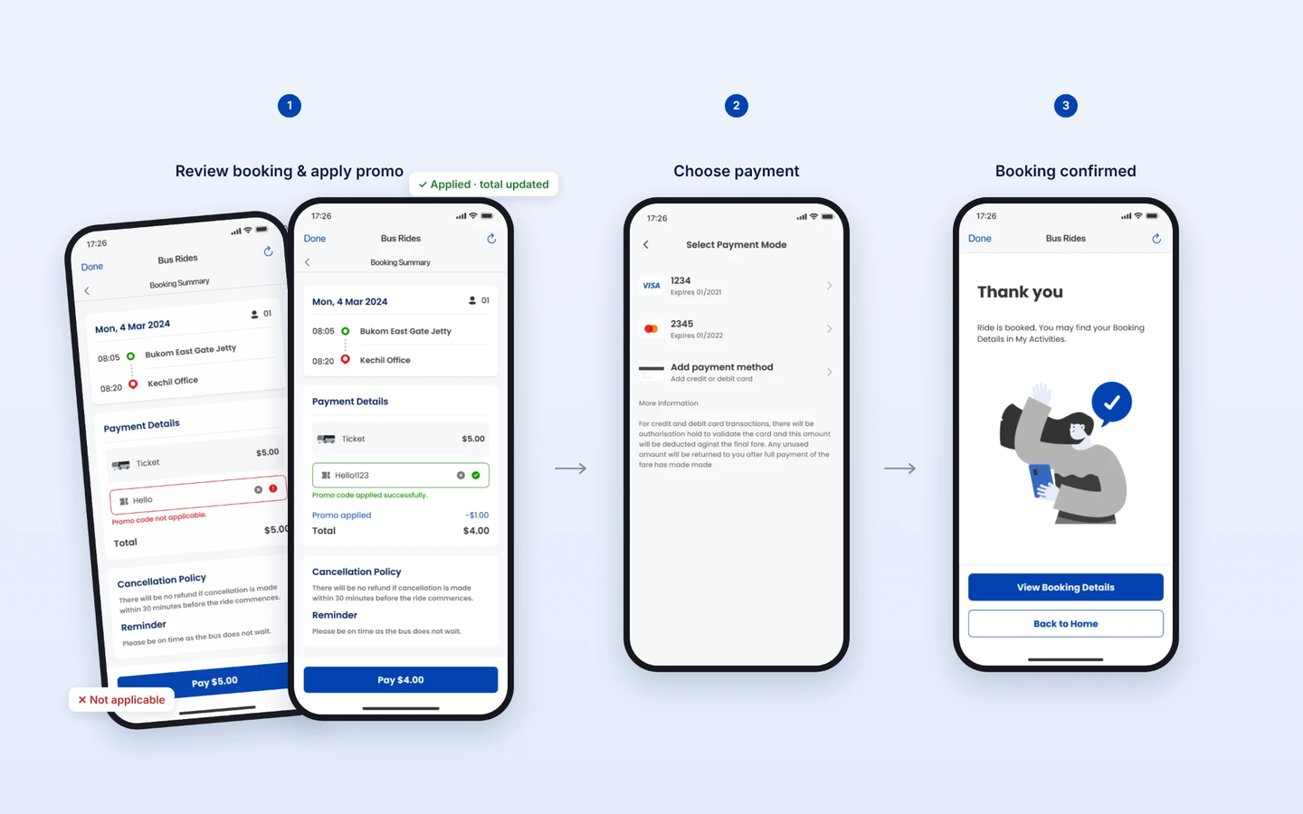
Redesigned CDG Zig interface
07 · Booking management
Extending the experience beyond the initial booking
The post-booking experience includes access to booking details and cancellation. These screens support users who need to review their transportation arrangements or manage an existing reservation.
Design decisions
- Made bookings easy to find from Activities, grouped into in-progress and past rides.
- Adapted the cancellation message to the refund policy: a refund more than 30 minutes before the ride, no refund within 30 minutes.
- Kept “Keep Booking” as the primary action and required a deliberate swipe to cancel.
- After cancelling, updated the booking status to Cancelled and kept the receipt available for reference.
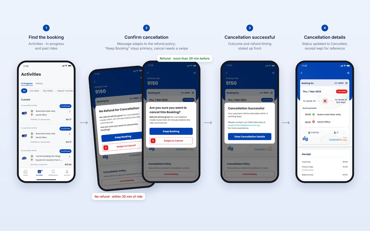
Redesigned CDG Zig interface
To summarize
08 · Collaboration & deliverables
Translating booking requirements into development-ready designs
I collaborated with the Product Manager and Developer throughout the design work, considering existing booking requirements and the CDG Zig design system.
My deliverables included Figma mobile interfaces, interactive prototypes, and design handoff materials.
- UI design exploration
- Interactive prototyping
Outcome: A set of mobile UI designs and interactive prototypes prepared for developer handoff.
09 · Reflection
Designing within an existing product ecosystem
This project strengthened my experience working with established workflows, product requirements, and design systems.
It reinforced the importance of understanding existing functionality before introducing design changes and communicating interactions clearly through prototypes and developer collaboration.
10 · 2026 retrospective
What I would explore today
Looking back at the original experience, I see further opportunities to strengthen booking clarity, error recovery, and accessibility. Areas I would investigate include:
- Clearer differentiation between pickup locations.
- Improved interpretation of booking time windows.
- Actionable alternatives when no vehicle is available.
- More accessible controls and interaction states.
- Validation of booking flows with representative corporate commuters.
These are retrospective ideas, not original project deliverables.