Case study
AGILCare
Featured case studyHelping hospital teams identify operational bottlenecks faster
Designing an AI-assisted command center that brings real-time hospital operations, patient flow and actionable insights into one connected experience.

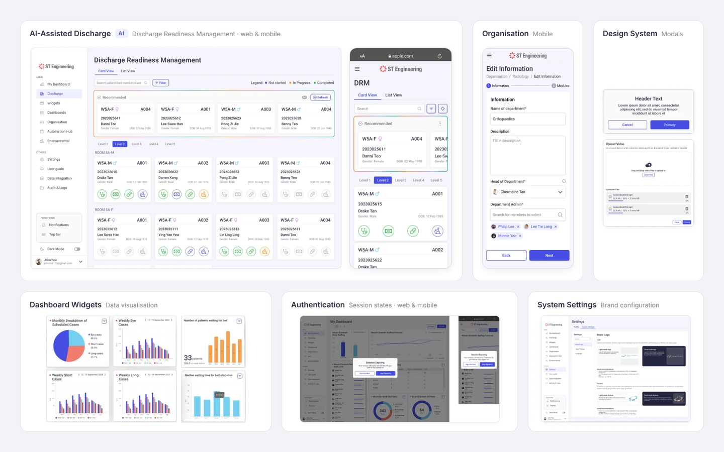
01 · Project overview
Designing operational clarity for a complex hospital environment
The challenge
Hospital teams work across multiple systems and operational workflows. Information about patient flow, beds, resources and other operational conditions can become fragmented, making hospital-wide situational awareness difficult.
My contribution
I designed experiences across:
- Dashboards
- Patient flow
- AI-assisted discharge
- System customization
- Authentication
Working within a broader enterprise platform and collaborating with product and engineering.
The outcome
Responsive feature designs and prototypes were prepared for MVP development and integration, establishing reusable interaction and interface patterns across multiple AGILCare modules.
02 · Context
Hospital operations don't happen in one system.
Emergency, surgery, ICU and administrative teams depend on multiple operational systems and workflows. Patient movement, resource allocation and hospital capacity can therefore be difficult to understand as one connected picture.
AGILCare is a next-generation hospital operations command centre designed to bring operational data, real-time monitoring and AI-driven insights into a connected environment — helping hospital teams understand current conditions and respond to operational demands.
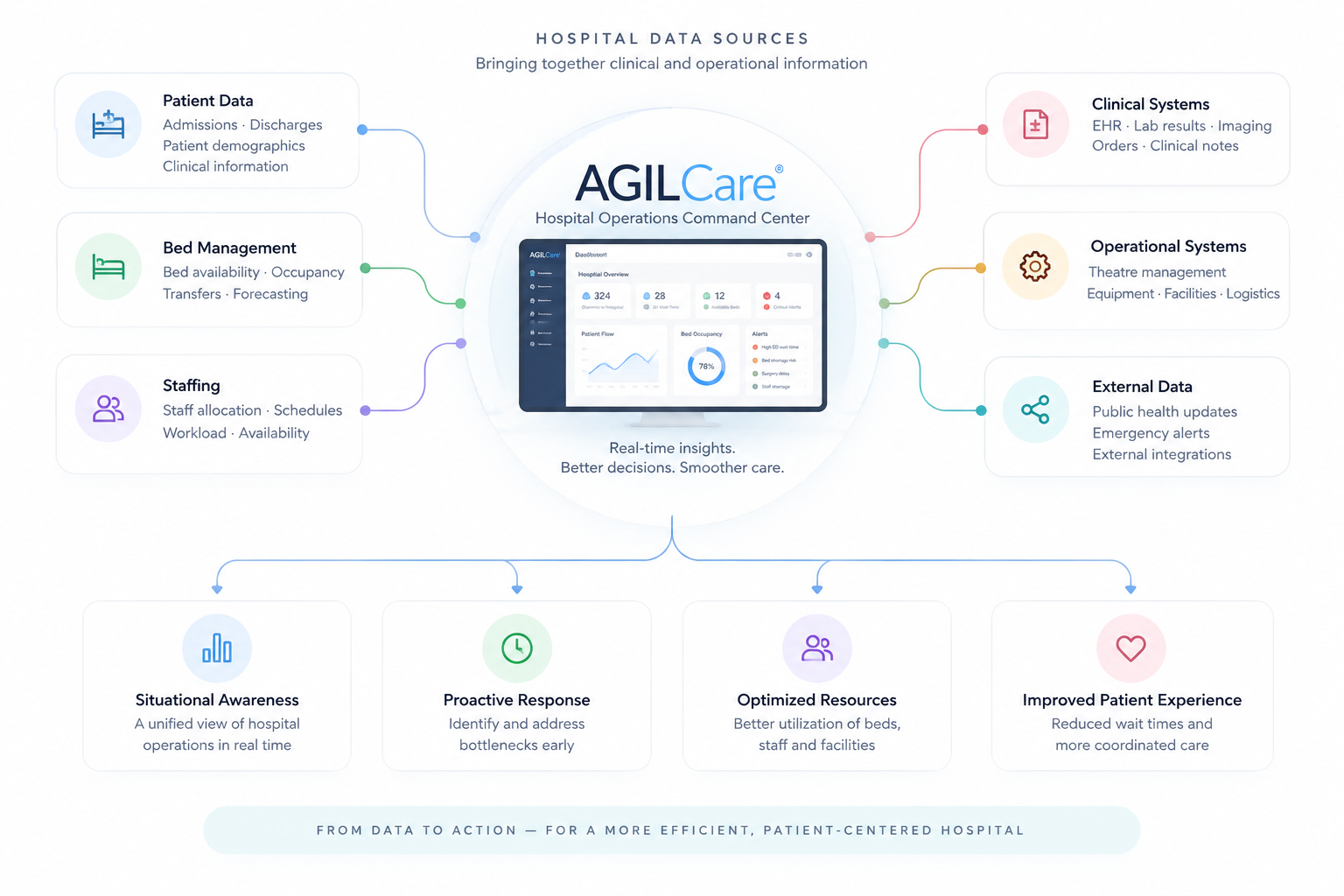
The product ambition
Turn fragmented operational information into a shared view of what is happening — and what may require attention.
03 · The challenge
The challenge wasn't displaying more data. It was making complexity understandable.
Information complexity
Hospital operations generate large amounts of information across patient flow, beds, capacity and other operational areas.
Design challenge:surface what matters without overwhelming the interface.
Workflow complexity
Operational conditions are interconnected. A delay at one stage of the patient journey can affect downstream capacity and resources.
Design challenge:preserve relationships between information rather than treating every metric in isolation.
Organizational complexity
Different hospital roles require different information, permissions and levels of control.
Design challenge:create a coherent platform that can adapt to different users and responsibilities.
Reduce cognitive complexity without removing operational complexity.
04 · My role
Designing across a connected enterprise platform
I contributed to multiple parts of the AGILCare experience, from operational dashboards and patient flow to AI-assisted workflows, system configuration and reusable design patterns.
I worked on
Dashboards
Operational monitoring & data visualization
Patient Flow
End-to-end journey visibility
AI-assisted Discharge
Decision-support workflow
System Settings
Flexible configuration & customization
Authentication
Secure access & session management
Design System
Reusable patterns & interface consistency
05 · Discovery
Before designing screens, I needed to understand the patterns behind complex enterprise products.
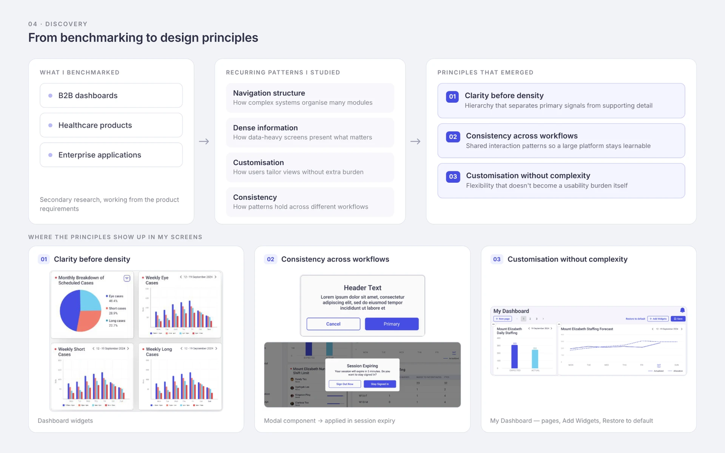
Working from the product requirements, I conducted secondary research and benchmarking across B2B dashboards, healthcare products and enterprise applications.
Rather than looking for interfaces to copy, I focused on recurring UX patterns: how complex systems structure navigation, present dense information, support customization and maintain consistency across different workflows.
Three principles emerged
01
Clarity before density
Operational information needs hierarchy so users can distinguish primary signals from supporting detail.
02
Consistency across workflows
A large platform becomes harder to learn when each module introduces different interaction patterns.
03
Customization without complexity
Enterprise users need flexibility, but additional configuration can itself become a usability burden.
06 · Design Strategy
From monitoring everything to understanding what needs attention.
Retrospective synthesis of the design approach
This became a useful way to think about the experience: dashboards should not simply display operational information. They should help users move from awareness toward investigation and action.
07 · Dashboard & Data Visualization
Turning real-time hospital data into information users can scan
Context
AGILCare’s Dashboard is the central operational interface, aggregating data from multiple hospital systems into configurable widgets for real-time monitoring and decision-making. The platform was designed to support different operational levels and user needs rather than provide a single static dashboard.
What I worked on
- Data visualization research
- Information hierarchy
- Widget explorations
- Real-time data presentation
- Ward placement
- Bed allocation
My contribution
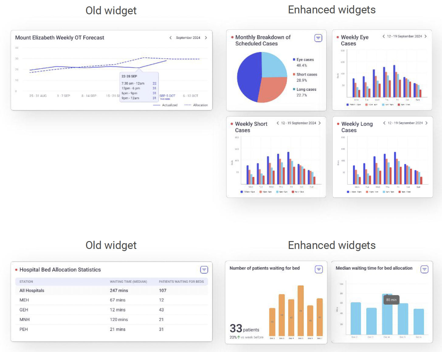
- Explored data-visualization patterns for operational dashboards.
- Designed new widgets for live hospital data.
- Covered patient placement and bed status across wards.
My focus: making dense operational data quick to understand, consistent with the wider AGILCare interface.
“The challenge wasn’t simply choosing a chart. It was deciding how different kinds of operational information should be structured, prioritized and compared.”
08 · Responsive Enterprise UX
Complex workflows don’t simply shrink to fit a smaller screen
Part of my work involved adapting data-heavy web experiences for mobile. Rather than reproducing desktop layouts at a smaller scale, I reconsidered navigation, information density, component behaviour and action hierarchy for narrower viewports.
Web — Full operational workspace
Mobile — Prioritised task view
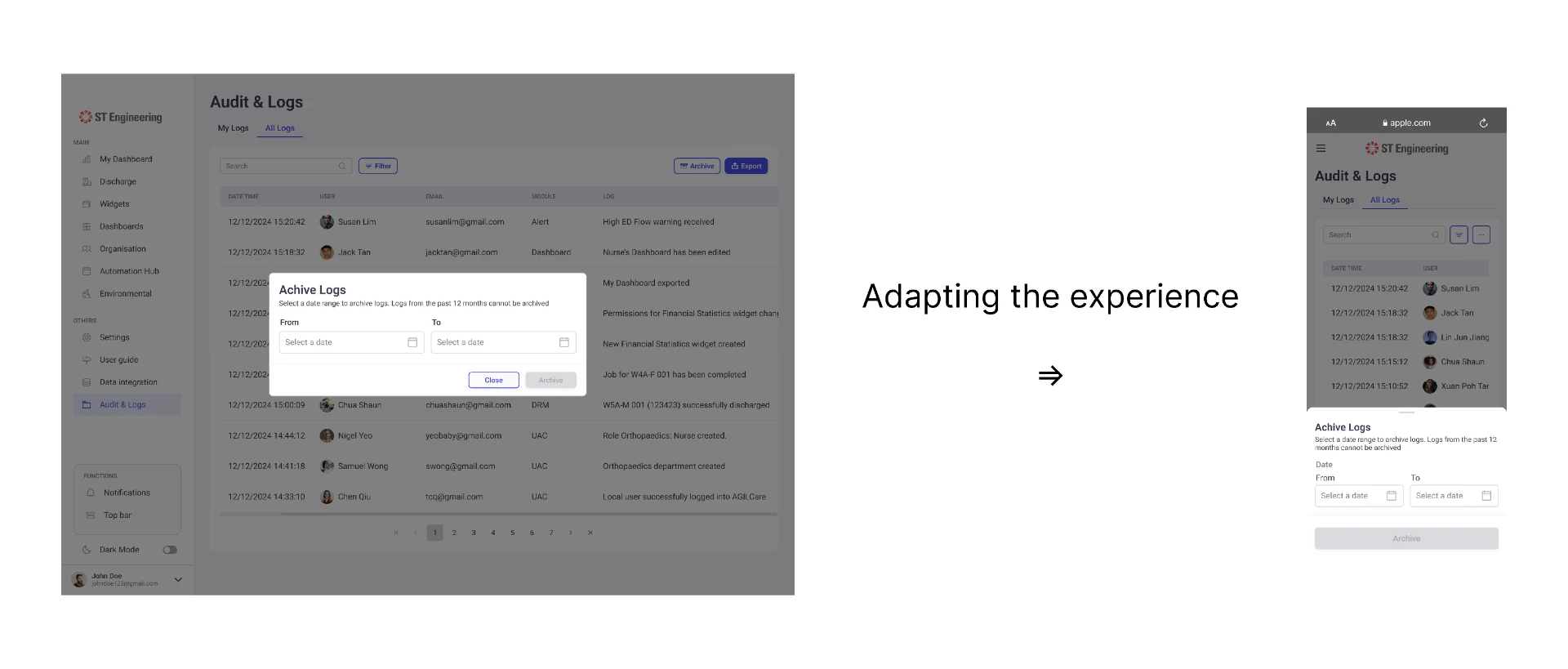
Navigation
Persistent sidebar → compact mobile navigation
Data density
Multi-column table → prioritised information
Actions
Visible toolbar actions → compact controls & overflow
Interaction pattern
Centered modal → mobile bottom sheet
09 · Restore Default Dashboard
Giving users a safe way back to a known state
Product context
AGILCare dashboards were designed to be configurable, allowing users to personalize layouts, widgets and visualizations according to their role and preferences.
My contribution
- Designed the Restore Default flow across web, tablet and mobile.
- Designed the confirmation and feedback states for resetting a customised dashboard.
- Mapped the end-to-end user flow.
- Created reusable modal patterns for the design system.
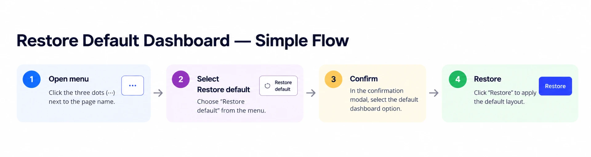
Swipe to see full diagram →
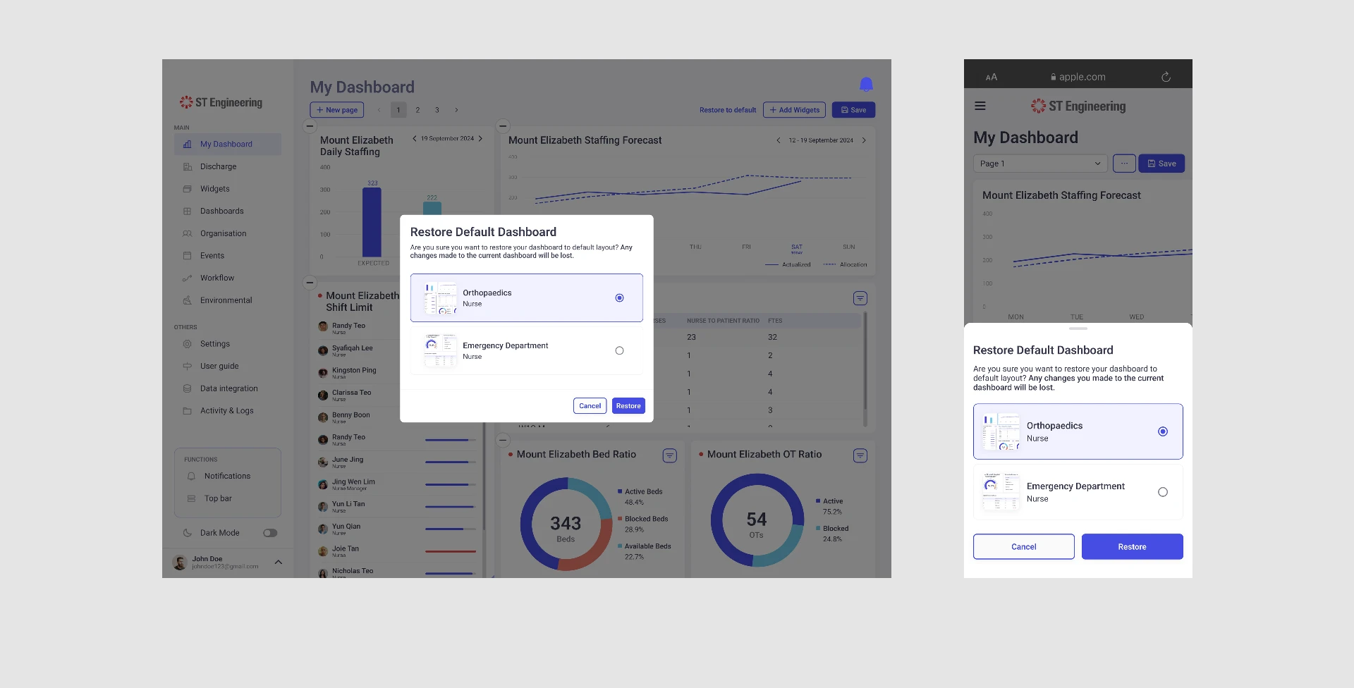 WebMobile
10 · Authentication & Access Control
Designing access across roles, devices and system states
Context
AGILCare’s access model is inherently complex. Authorization is organized through Departments → Roles → Members; modules can be assigned at department level, granular access rights at role level, and members inherit the relevant access.
Organisation / User Access
My role
- Reviewed web designs created by another designer.
- Adapted the Organisation / User Access experience for mobile.
- Kept the hierarchical access logic intact on a much smaller screen.
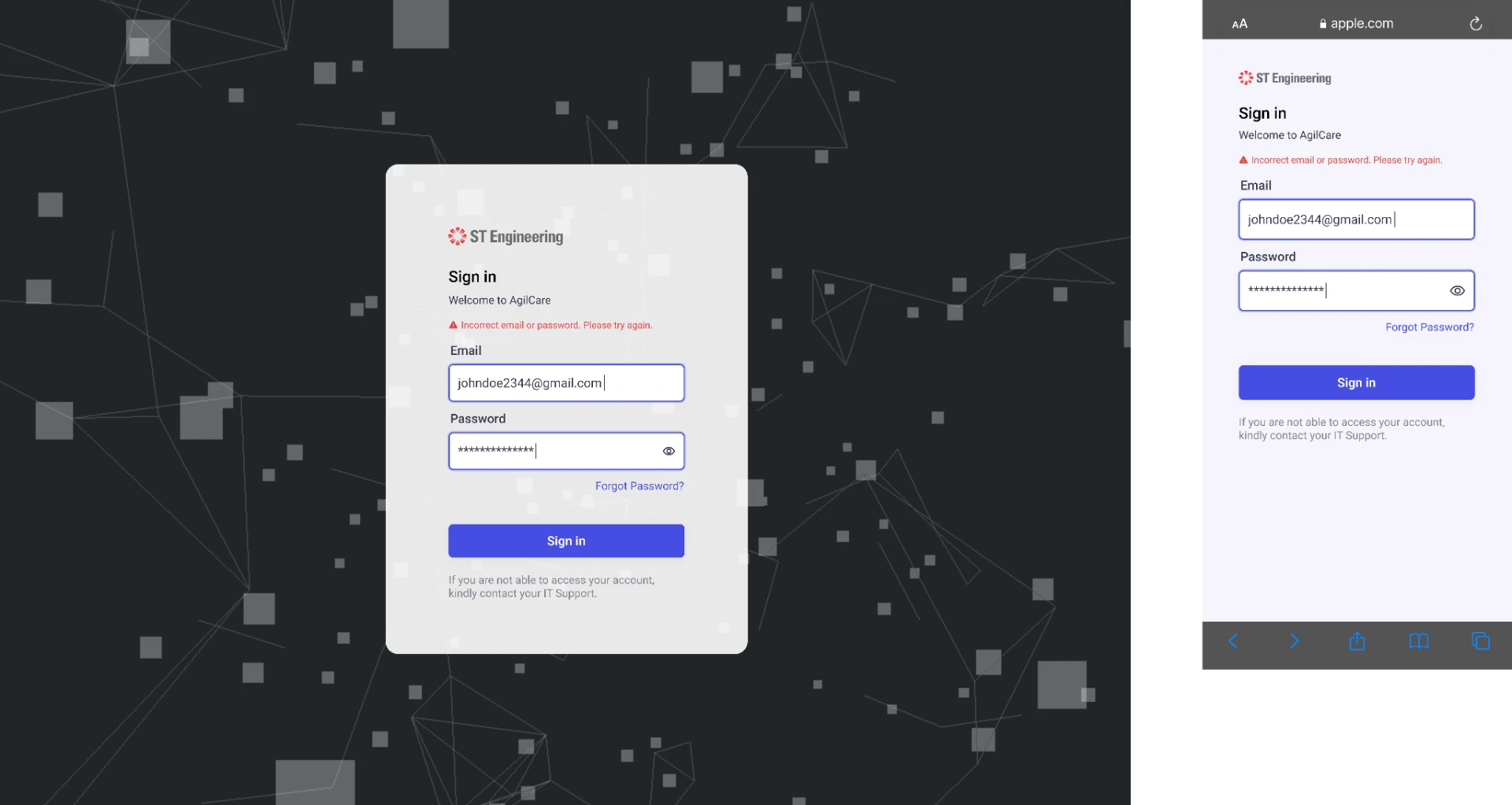
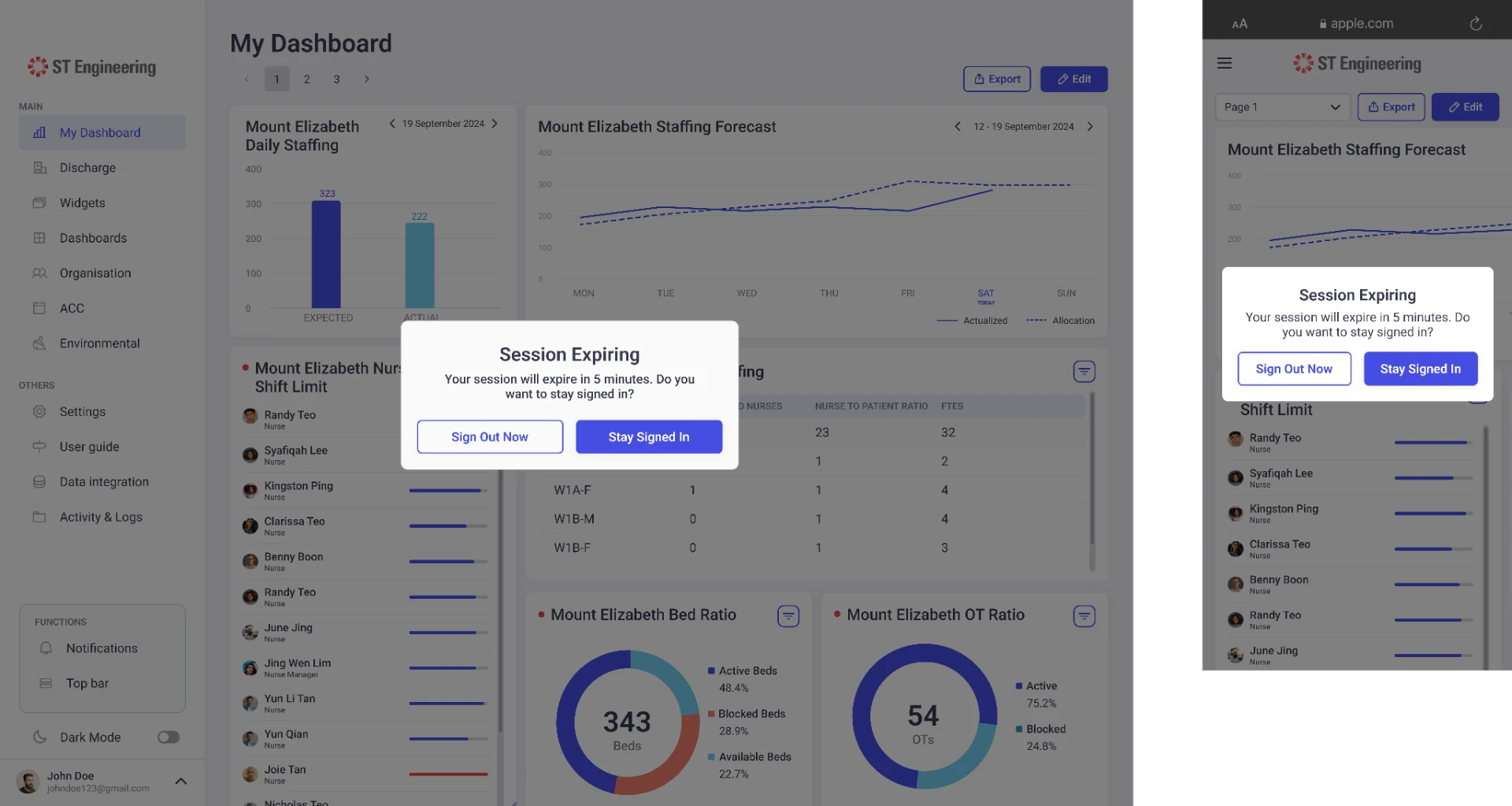
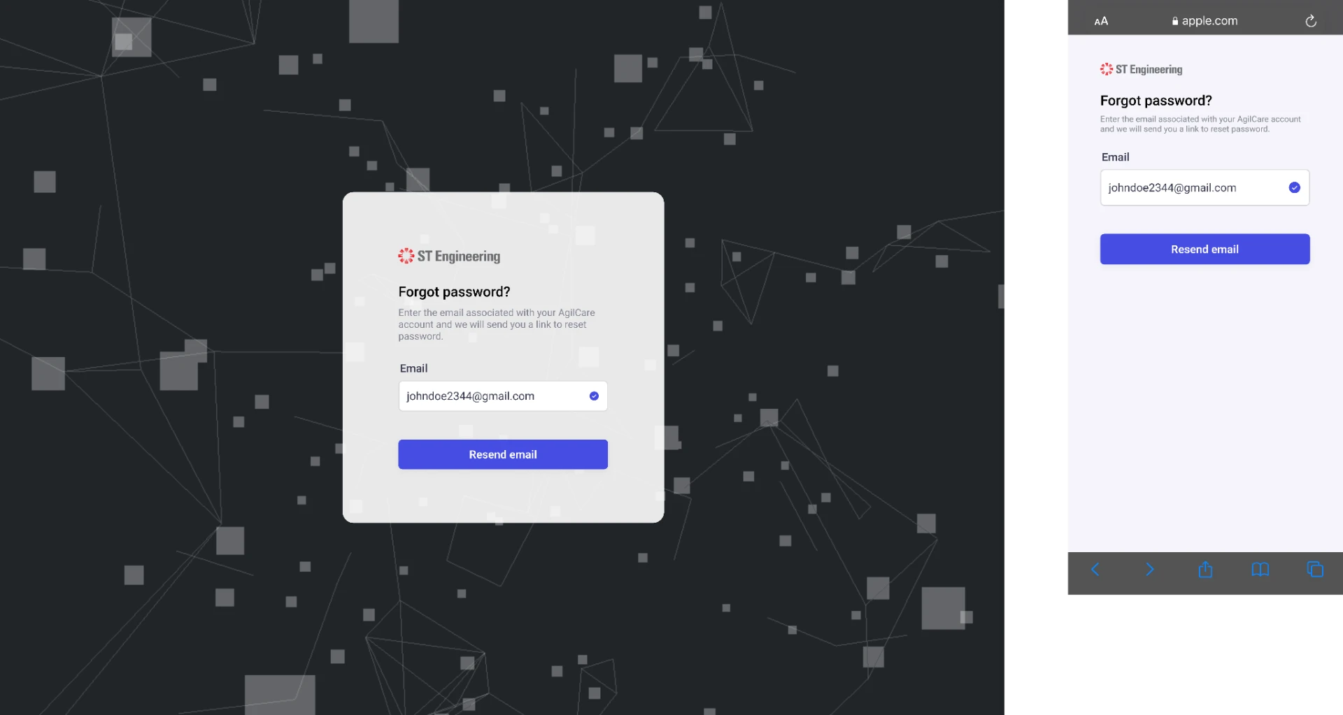
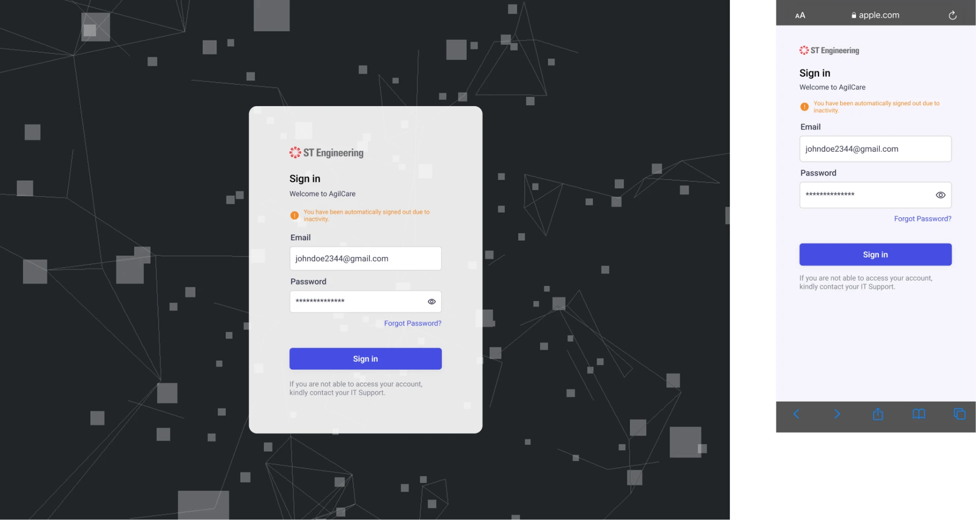
Local User Authentication
My role
- Designed user flows and interface states for local-account sign-in.
- Covered sign-in errors, password reset, session-expiry warnings and inactivity.
Authentication isn’t one screen.
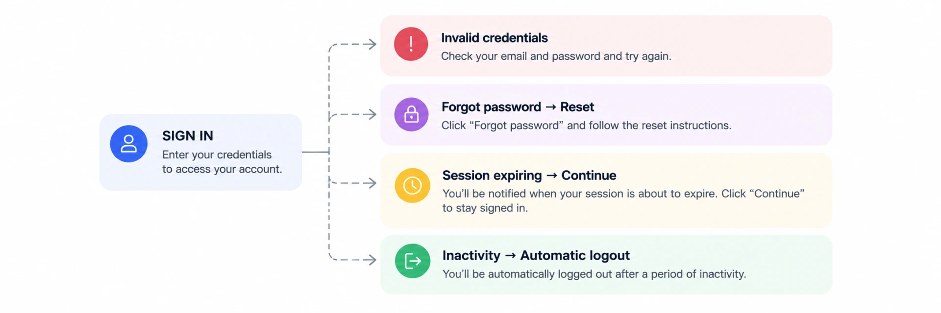
Swipe to see full diagram →
11 · AI-Assisted Discharge
Making AI-driven discharge recommendations visible within existing workflows
Context
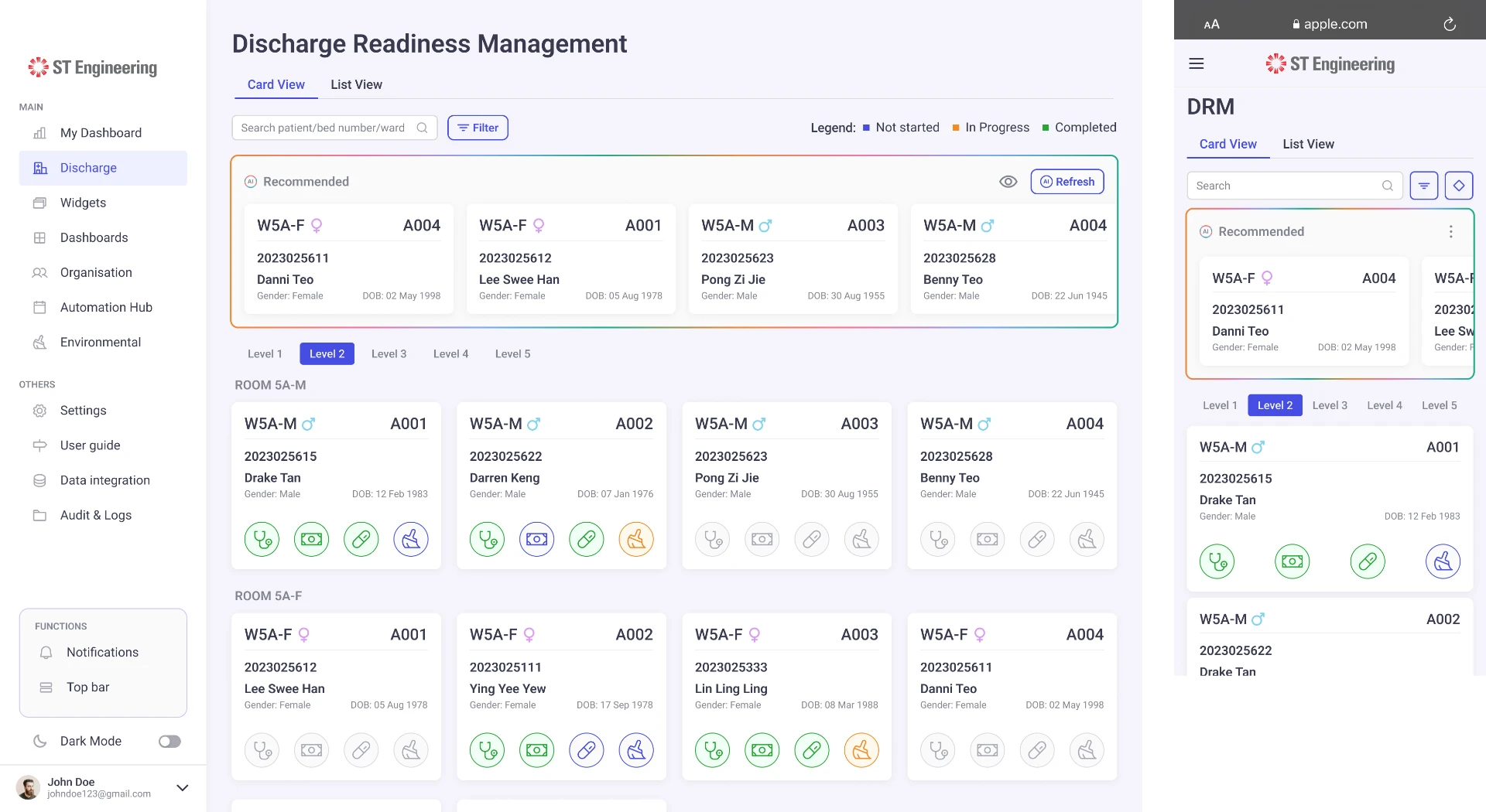
AGILCare’s Discharge Readiness Module supports hospital teams in monitoring patient discharge readiness. The AI-assisted feature introduces a dedicated recommendation area, highlighting patients identified as potentially ready for discharge directly within the existing dashboard.
My contribution
- Designed web and mobile UI variations for AI-generated discharge recommendations.
- Defined how recommended patients are presented.
- Fitted the new recommendation area into the existing dashboard layout.
- Kept the interface clear and consistent across screen sizes.
- Updated existing screens to show the feature within the discharge workflow, without changing the underlying process.
12 · System Settings
End-to-End Module Ownership
Designing customization into an enterprise platform
Context
AGILCare needed to accommodate different hospital environments while maintaining a coherent product experience.
My contribution
- Designed the System Settings module across responsive web, tablet and mobile.
- Enabled administrators to configure platform-level presentation settings.
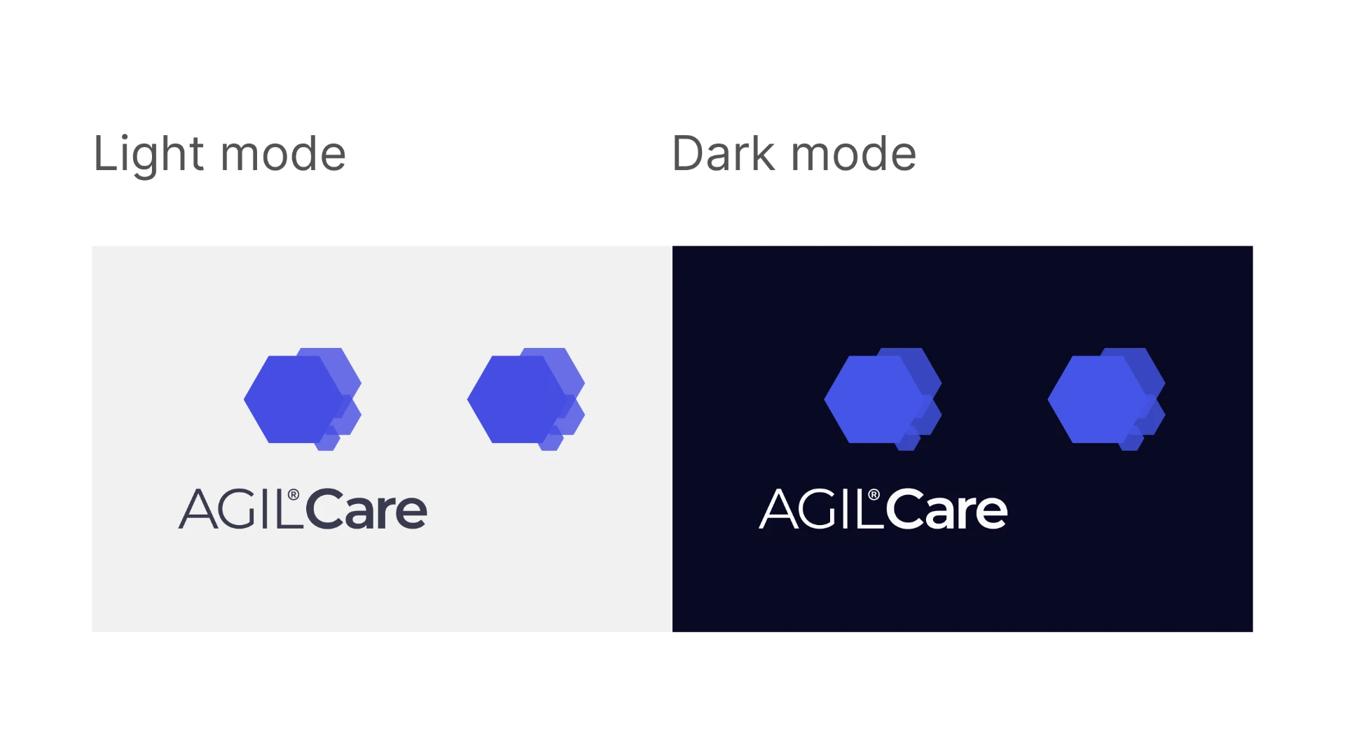
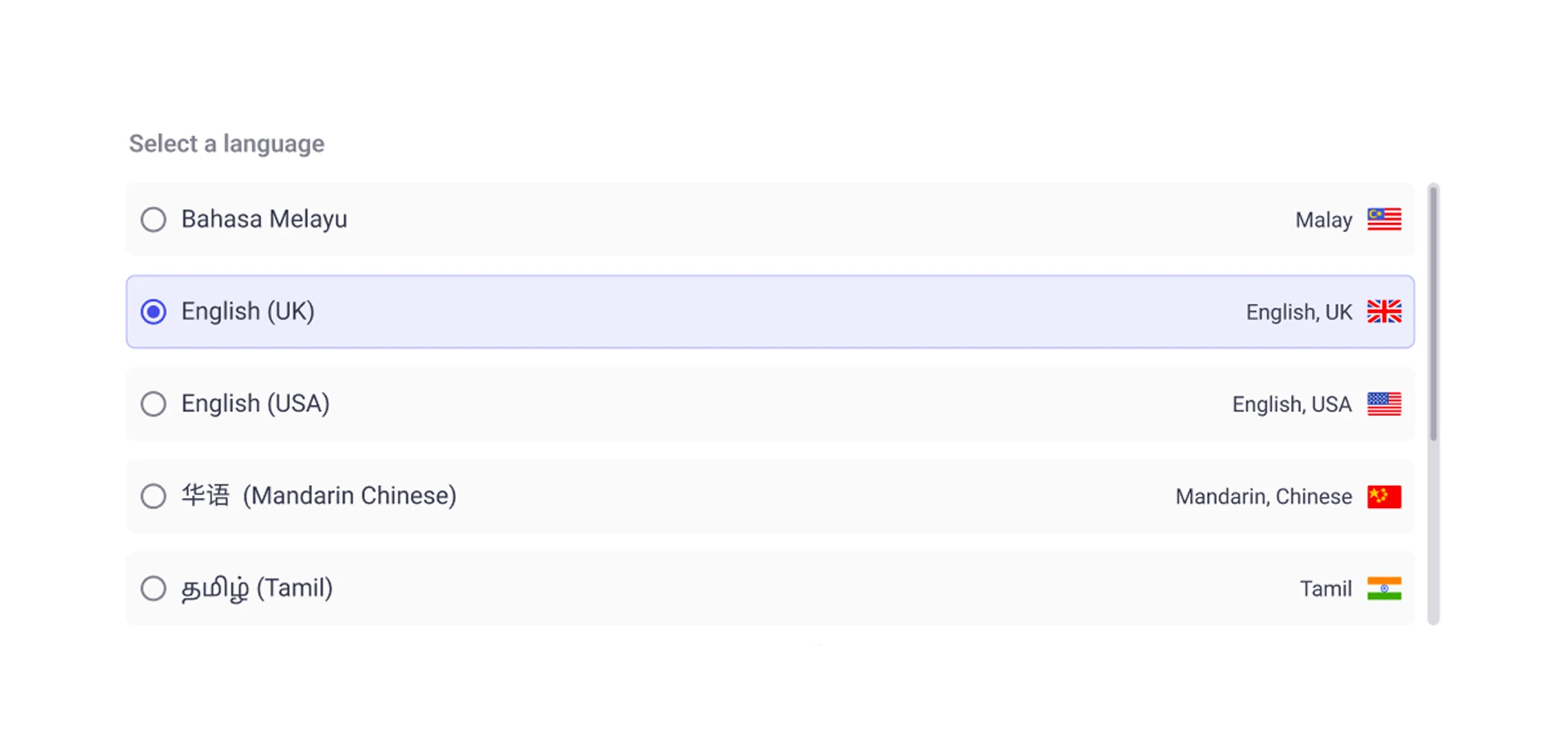
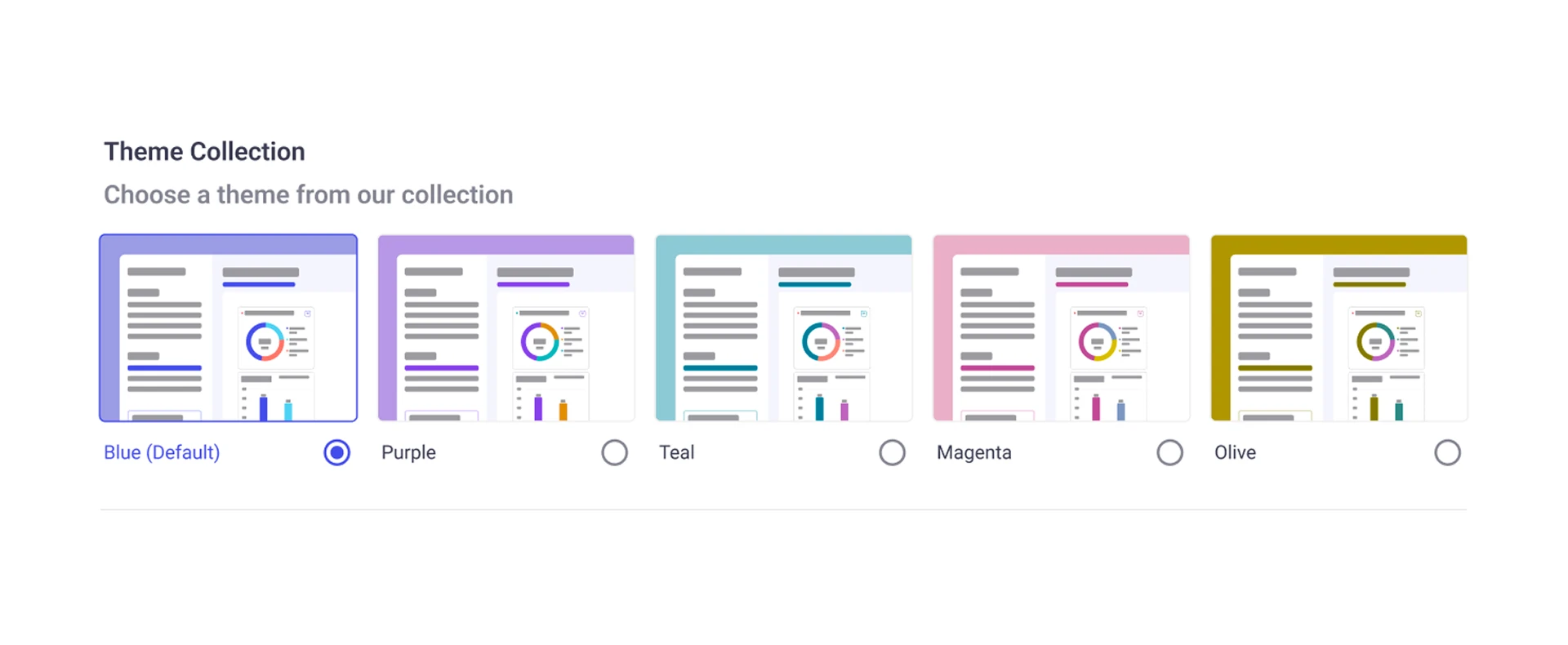
- Covered light- and dark-mode logos, colour themes and language support.
The UX problem
How do you give organizations control over brand expression without compromising the usability of the product?
System Settings
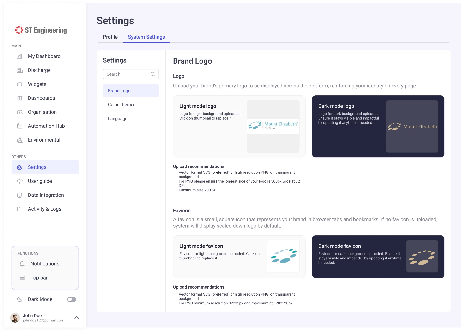
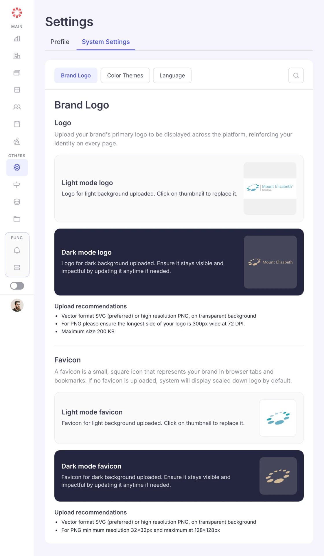
My focus was on creating clear settings interactions, consistent UI patterns, and responsive layouts that support the same configuration tasks across devices.
Brand Assets
Uploading and managing logo variations for light and dark themes.
Language
Providing controls for language configuration.
Color Theme
Configuring brand colors within the platform's visual system.
13 · Design System & Platform Documentation
Building consistency beyond individual screens
Working across multiple AGILCare modules required the interface to remain consistent while also supporting customization for different hospital environments.
My contribution to the design system included both reusable UI components and platform-level documentation defining how visual rules should be applied.
Components
Extending the component library
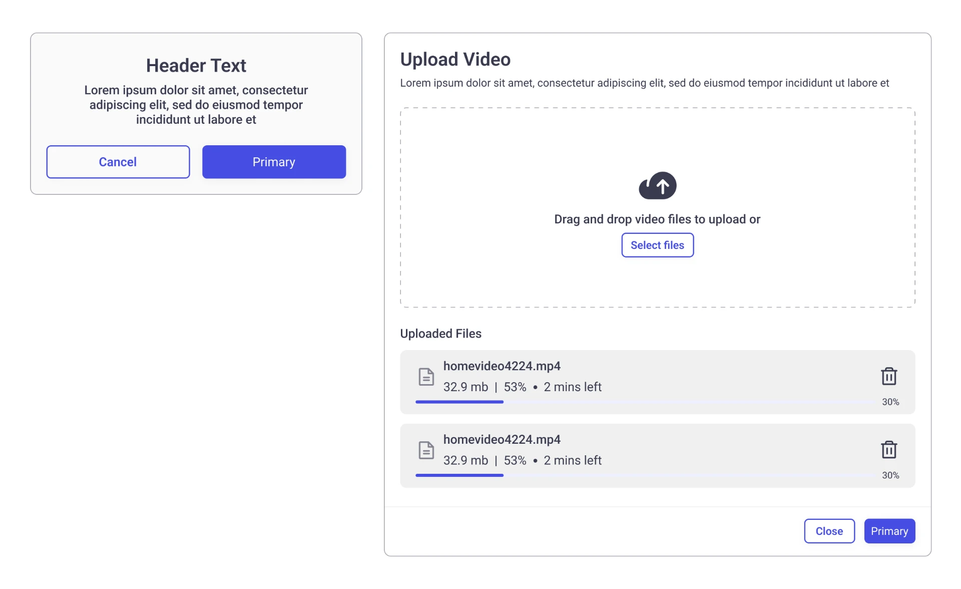
I created and documented reusable components, including patterns such as steppers and toast notifications, so recurring interactions could be implemented consistently across the platform.
Stepper
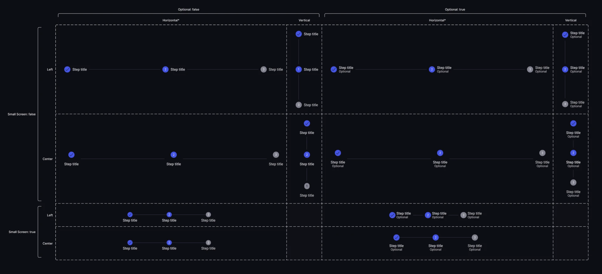
Swipe to see full diagram →
Toast
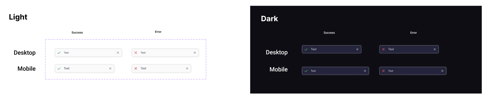
Swipe to see full diagram →
Modal
Brand Color Application
Creating rules for client branding without sacrificing usability
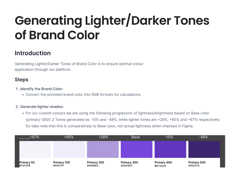
Because AGILCare could be configured for different organizations, introducing a client's brand color couldn't simply mean replacing the platform's primary color everywhere.
I created UI documentation defining how client brand colors should be incorporated into the platform while preserving visual hierarchy, consistency, usability and accessibility.
Swipe to see full diagram →
I worked on
Dashboards
Data visualization & real-time widgets
Responsive UX
Translating complex workflows to mobile
Authentication & Access
User flows, states & mobile adaptation
AI-assisted Discharge
AI-triggered interface states
System Settings
End-to-end responsive module design
Design System
Components, theming & UI documentation
To summarize
14 · Collaboration
Designing within a multidisciplinary team
I collaborated with designers, product stakeholders, developers, and data specialists to deliver consistent UI solutions within an established enterprise platform.
Through design reviews, responsive adaptations, and reusable components, I contributed to improving clarity and consistency across AGILCare's workflows.
15 · Outcome
Extending the platform across features and devices
My contributions included:
- Dashboard widgets: New visualisations for hospital operations.
- Restore Default Dashboard: User flow and responsive confirmation experience.
- Authentication & access: Sign-in states, error handling, and mobile adaptations.
- AI-assisted discharge: Integration of AI recommendations into existing desktop and mobile interfaces.
- System Settings: Responsive configuration screens for branding, themes, and language.
- Design system: Reusable components and documentation.
Together, these deliverables supported a more consistent experience across the platform.
16 · Reflection
Designing beyond individual screens
AGILCare strengthened my understanding of enterprise UX, where clarity, consistency, and connected workflows matter as much as individual interfaces.
I learned to approach responsive design as a reconsideration of information hierarchy and interaction patterns, rather than simply resizing layouts.
17 · 2026 Retrospective
What I would approach differently today
Looking back, I see opportunities to strengthen the design process through:
- Earlier usability validation to better understand user priorities.
- Clearer responsive guidelines for components and complex workflows.
- Deeper exploration of edge cases including errors and permissions.
- Measurable usability goals to evaluate design effectiveness.
AGILCare helped shape my approach to product design: creating experiences that are not only visually consistent, but also scalable, understandable, and adaptable.
Retrospective observations from 2026, not changes implemented during the original project.